
It completely slipped my mind, so to celebrate its belated birthday, here’s a tutorial on how I turn my flat type drawings into fun typographic illustrations. It’s the more advanced version of my first tutorial, which goes over the basics of taking drawings from paper to Photoshop. Hope you enjoy this little insight into my process!
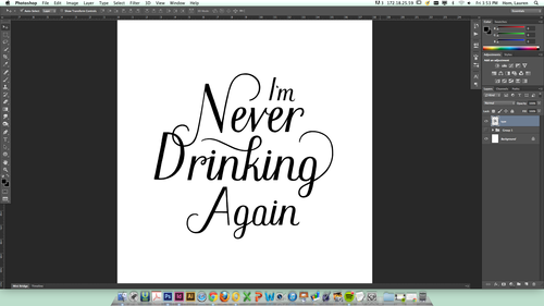
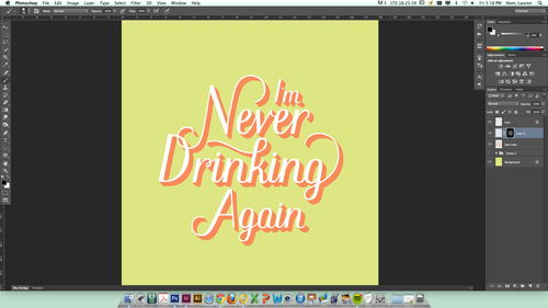
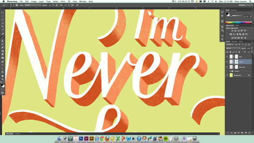
1. I start with my isolated type on one layer, and a clean white background behind it.
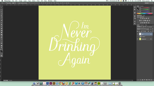
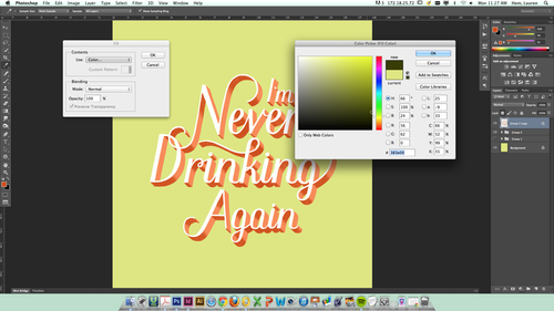
2. Next, I fill the background with some delightful color. I chose green in honor of all the picklebacks I did with my friends this weekend haha. Then, I pixel-lock the type layer and fill it with another color that pops, usually white. This layer will be the base that I build the type off of.
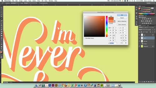
3. I duplicate the type layer on top of the original one, pixel-lock it too, and fill it with another color (this color will become the 3D part of the lettering).
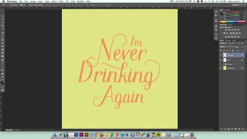
4. Then, I place this new colored layer behind the original white type and nudge it over to a depth that I like.
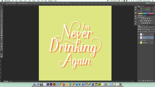
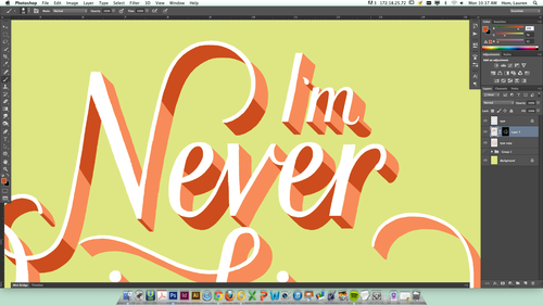
5. Using a small, rounded brush, I draw lines connecting the colored background to the white type in front of it. This builds the framework for the 3D type.
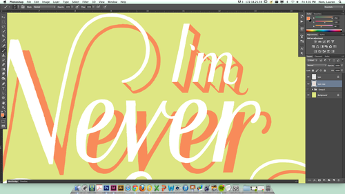
6. Using a larger brush, I fill in the outlines of the colored type with the same color.
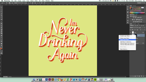
7. Next, I select the colored type layer (press command while clicking on the little layer preview image in the layer panel). With the outline of the type selected, I create a new layer above it and make a clipping mask with the selection. This allows me to shade in the type in this exact shape. If you’re not familiar with clipping masks, I recommend pouring yourself a drink and watching a Youtube tutorial.
8. After selecting a darker shade of the color I’m using, I paint in rough shadows on top of my colored type.
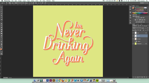
9. I right click over the clipping mask icon in my layers panel and select “Apply Layer Mask”. This crops my shading to the mask and turns the layer back to normal, so I can add a new, empty clipping mask to it for texturing. Then I select a texture brush from my panel (you can find a zillion good ones if you just Google “free PSD texture brushes”).
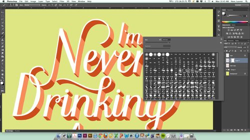
10. Using a large black brush (black knocks out part of the image in a clipping mask, white brings it back), I add texture to the layer in the clipping mask. I alternate between adding and removing texture until I find a good balance. Then I add clipping masks to the other type layers and texture them using the same process.
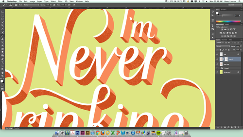
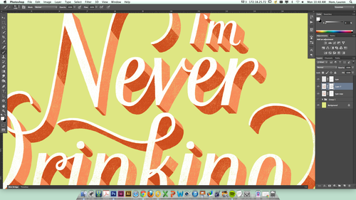
11. Now I change my same texture brush to a much smaller size to soften up the edges of the shading and give it a smooth look. Lots of little taps/clicks with the brush on the sharp edges usually does the trick.
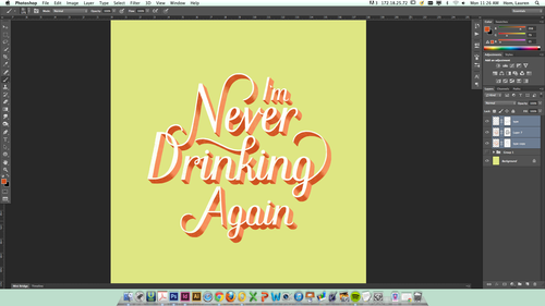
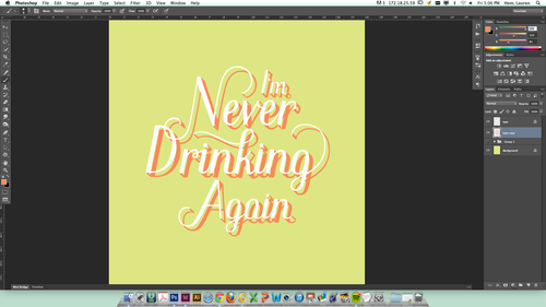
12. Shadow time! I select all of my type layers (white, pink, and shading) and group them together. Then I duplicate the group and merge the layers together, creating on shape from the type. I pixel-lock that layer and fill it with a very dark version of the background color.
13. I move the dark green layer behind the rest of the type, lower the opacity to 10% or so, and nudge it down vertically a few bumps to give the type some more dimension.
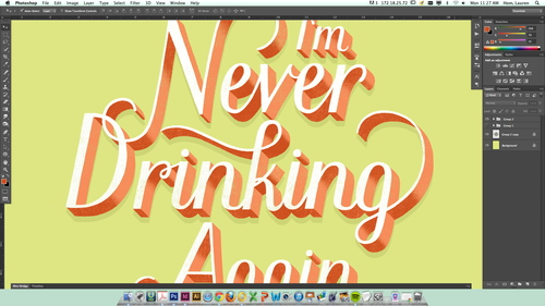
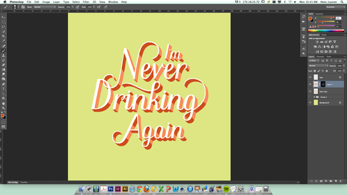
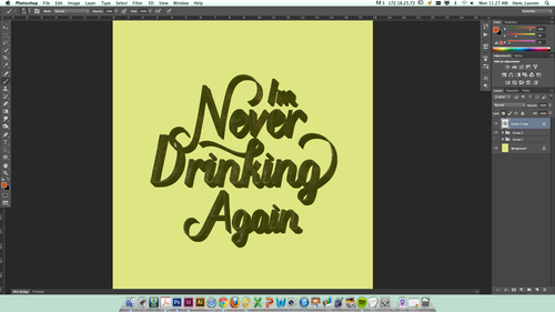
14. Next, I add a paper texture to the file and send it to the very bottom of all my layers. I make a clipping mask on the background color layer and texture it the same way I did my type.
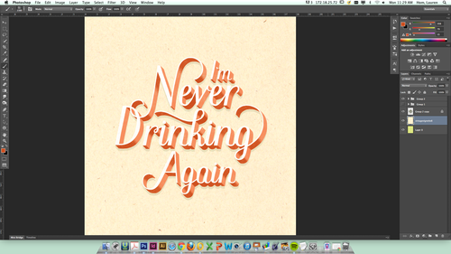
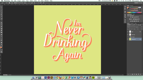
15. The end! Piece of cake. Mmm…chocolate cake.
Thank you to everyone who has supported the blog for the past year! Long live the lovely little liars.


